显示中文 import matplotlib.pyplot as pltplt.rcParams['font.sans-serif' ]=['SimHei' ] plt.rcParams['axes.unicode_minus' ]=False
x,y轴等比例 import pylab as pltb=plt.plot([1 ,2 ,3 ,4 ]) ax = plt.gca() ax.set_aspect(1 )
绘图 mpl.rcParams['font.sans-serif' ] = ['SimHei' ] mpl.rcParams['axes.unicode_minus' ] = False df = pd.read_csv(r'小凸轮轴测试t02.csv' ) fig, axs = plt.subplots(2 , 1 ) ax_raw, ax_fitdiff = axs x = df['t1' ] y = df['t2' ] ax_raw.grid(True , linestyle='-.' ) ax_raw.set_title('原始数据和拟合数据' ) ax_raw.plot(x, y, 'r' , label='raw data' ) df = df[df.t2 < -1000 ] df = df.reset_index(drop=True ) x = df['t1' ] df_yfit, df_diff = gen_fit(x, df['t2' ], 32 ) ax_raw.plot(x, df_yfit['t2' ], 'g' , label='fit data' ) ax_fitdiff.grid(True , linestyle='-.' ) ax_fitdiff.set_title('原始数据和拟合数据差值' ) ax_fitdiff.plot(x, df_diff['t2' ], 'b' , label='diff data' ) ax_raw.set_xlabel('X轴-脉冲数' ) ax_raw.set_ylabel('Y轴-高度(um)' ) ax_raw.legend(('原始数据' , '拟合数据' ), loc='best' , shadow=True ) ax_fitdiff.set_xlabel('X轴-脉冲数' ) ax_fitdiff.set_ylabel('Y轴-高度差值(um)' ) ax_fitdiff.legend(('差值数据' ,), loc='best' , shadow=True ) plt.show()
backend website
There are three ways to configure your backend:
The rcParams[“backend”] (default: ‘agg’) parameter in your matplotlibrc file
import matplotlibmatplotlib.use("TKAgg" )
legend 显示不全 ax.legend(line1, ('原始数据' ,))
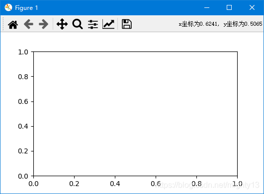
remove legend 光标值取消科学标记法 import matplotlib.pyplot as plt def format_coord(x, y): return 'x:%1.4f, y:%1.4f' % (x, y) #获取当前子图 ax=plt.gca() ax.format_coord = format_coord plt.show()
remove line2d 支持子图 plt.subplot(211 ) show_data(df_data, 'pulse' , 'value' , 'number1-value' ) plt.subplot(212 ) plt.plot(df_angle, value, label='measure center' )
不等分子图 上面 2 个,下面 1 个
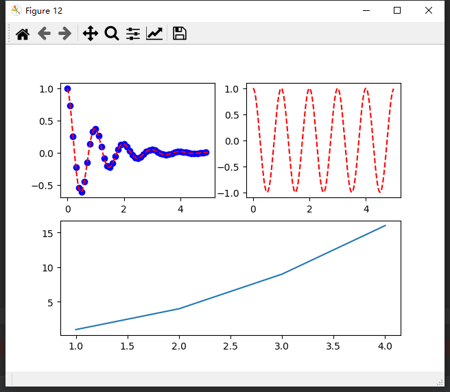
def test (): import matplotlib.pyplot as plt import numpy as np def f (t ): return np.exp(-t) * np.cos(2 * np.pi * t) t1 = np.arange(0 , 5 , 0.1 ) t2 = np.arange(0 , 5 , 0.02 ) plt.figure(12 ) plt.subplot(221 ) plt.plot(t1, f(t1), 'bo' , t2, f(t2), 'r--' ) plt.subplot(222 ) plt.plot(t2, np.cos(2 * np.pi * t2), 'r--' ) plt.subplot(212 ) plt.plot([1 , 2 , 3 , 4 ], [1 , 4 , 9 , 16 ]) plt.show()
上面 1 个,下面 2 个
def test (): import matplotlib.pyplot as plt import numpy as np def f (t ): return np.exp(-t) * np.cos(2 * np.pi * t) t1 = np.arange(0 , 5 , 0.1 ) t2 = np.arange(0 , 5 , 0.02 ) grid = plt.GridSpec(2 , 2 , wspace=0.2 , hspace=0.2 ) plt.subplot(grid[0 ,0 :2 ]) plt.plot(t1, f(t1), 'bo' , t2, f(t2), 'r--' ) plt.subplot(grid[1 ,0 ]) plt.plot(t2, np.cos(2 * np.pi * t2), 'r--' ) plt.subplot(grid[1 ,1 ]) plt.plot([1 , 2 , 3 , 4 ], [1 , 4 , 9 , 16 ]) plt.show()
pycharm 图形独立显示 File->Settings->Tools->Python Scientific
color plt.plot(x, y, linewidth = '1' , label = "test" , color=' coral ' , linestyle=':' , marker='|' )
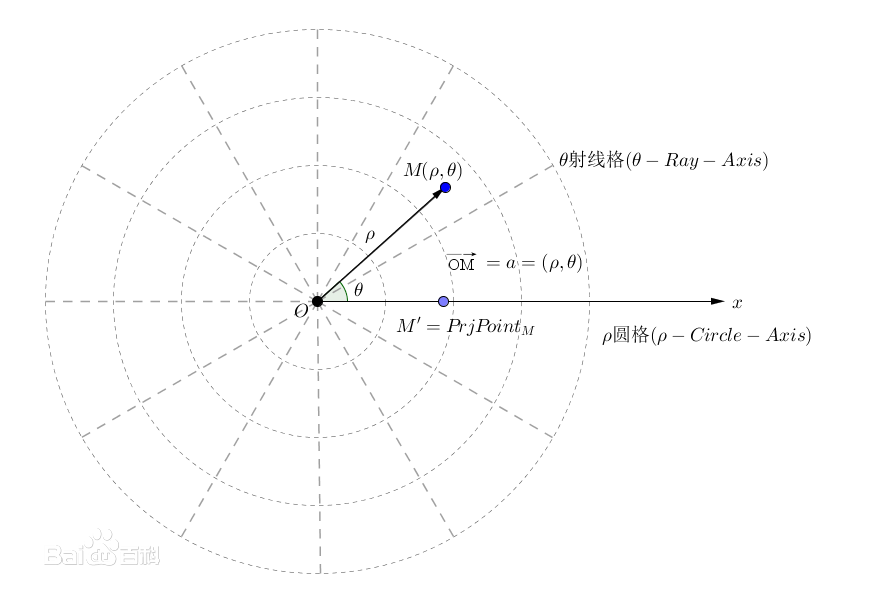
极坐标系 在平面内取一个定点O,叫极点,引一条射线Ox,叫做极轴,再选定一个长度单位和角度的正方向(通常取逆时针方向)。对于平面内任何一点M,用ρ表示线段OM的长度(有时也用r表示),θ表示从Ox到OM的角度,ρ叫做点M的极径,θ叫做点M的极角,有序数对 (ρ,θ)就叫点M的极坐标,这样建立的坐标系叫做极坐标系。通常情况下,M的极径坐标单位为1(长度单位),极角坐标单位为rad(或°)
绘制矩形 from matplotlib import patchesrect = patches.Rectangle((Coords1x,Coords1y),Coords2x-Coords1x,Coords2y-Coords1y,linewidth=1 ,edgecolor='r' ) ax = plt.gca() ax.add_patch(rect) ax.figure.canvas.draw()
工具栏 pygarden conda install kivy -c conda-forge pip install kivy-garden garden install matplotlib
动态交互 Rectangle Selector def rect_select_callback (eclick, erelease ): 'eclick and erelease are the press and release events' x1, y1 = eclick.xdata, eclick.ydata x2, y2 = erelease.xdata, erelease.ydata print ("(%3.2f, %3.2f) --> (%3.2f, %3.2f)" % (x1, y1, x2, y2)) print (" The button you used were: %s %s" % (eclick.button, erelease.button)) def toggle_selector (event ): print (' Key pressed.' ) if event.key in ['Q' , 'q' ] and event.toggle_selector.RS.active: print (' RectangleSelector deactivated.' ) event.toggle_selector.RS.set_active(False ) if event.key in ['A' , 'a' ] and not event.toggle_selector.RS.active: print (' RectangleSelector activated.' ) event.toggle_selector.RS.set_active(True ) def onZoomCallback (event ): if toggle_selector.RS.active: toggle_selector.RS.update() toggle_selector.RS = RectangleSelector(self.ax, rect_select_callback, drawtype='box' , useblit=True , button=[1 ], minspanx=5 , minspany=5 , spancoords='pixels' , interactive=True ) self.canvas.mpl_connect('key_press_event' , toggle_selector) self.canvas.mpl_connect('draw_event' , onZoomCallback)
spanSelector from itertools import cycleimport matplotlib.pyplot as pltfrom matplotlib.widgets import SpanSelectorimport numpy as npif __name__ == '__main__' : t = np.arange(180 ) value = (20 * np.sin((np.pi/2 ) * (t / 22.0 )) + 25 * np.random.random((len (t),)) + 50 ) fig, ax = plt.subplots(1 , 1 , figsize=(10 , 5 )) ax.step(t, value) ax.set_ylabel("Stock Price (USD)" ) ax.set_xlabel("Time (days)" ) colors = cycle(list ('rbymc' )) def onselect (x0, x1 ): ax.axvspan(x0, x1, facecolor=next (colors), alpha=0.5 ) fig.canvas.draw_idle() ss = SpanSelector(ax, onselect, 'horizontal' ) plt.show() self.ax.axvspan(it['points' ][0 ], it['points' ][2 ], facecolor='r' , alpha=0.5 )
激活,停止 使用
def on_chk_ProgMode (self ): if self.chkProgMode.get(): print ('mpl_connect spanCID' ) self.span = SpanSelector(self.ax, self.onselect, 'horizontal' , useblit=True , span_stays=True ) self.spanCID = self.fig.canvas.mpl_connect('key_press_event' , self.span) else : self.span.set_visible(False )
设置坐标轴 x_major_locator = MultipleLocator(10 ) ax_raw.xaxis.set_major_locator(x_major_locator) plt.xlim((-5 , 5 )) plt.ylim((-2 , 2 )) my_x_ticks = np.arange(datas.loc[:, "角度1" ].min (), datas.loc[:, "角度1" ].max (), 20 ) my_y_ticks = np.arange(datas.loc[:, "数值" ].min (), datas.loc[:, "数值" ].max (), 500 ) plt.xticks(my_x_ticks) plt.yticks(my_y_ticks) my_x_ticks = np.arange(datas.loc[:, "角度1" ].min (), datas.loc[:, "角度1" ].max ()) my_y_ticks = np.arange(datas.loc[:, "数值" ].min (), datas.loc[:, "数值" ].max ()) plt.xticks(my_x_ticks) plt.yticks(my_y_ticks) ax = plt.axes() ax.xaxis.set_major_locator(plt.MaxNLocator(15 )) ax.yaxis.set_major_locator(plt.MaxNLocator(15 )) x_major_locator = MultipleLocator(1 ) y_major_locator = MultipleLocator(1 ) ax1.xaxis.set_major_locator(x_major_locator) ax1.yaxis.set_major_locator(y_major_locator) ax1.set_aspect(1 )
散点图 N = 10 x = np.random.rand(N) y = np.random.rand(N) plt.scatter(x, y, alpha=0.6 ) plt.show()
柱状图 plt.subplot(312 ) y = normalization_half_y[1 :50 ] bar_plot = plt.bar(half_x[1 :50 ], normalization_half_y[1 :50 ]) plt.title('傅里叶变换' , fontsize=9 , color='blue' ) plt.grid() def autolabel (rects ): for idx, rect in enumerate (bar_plot): height = rect.get_height() plt.text(rect.get_x() + rect.get_width() / 2. , 1.05 * height, '%.4f' % (y[idx]*100 ), ha='center' , va='bottom' , rotation=0 ) autolabel(bar_plot)
茎叶图 stem(x,y, linefmt=None , markerfmt=None , basefmt=None ) x,y分别是横纵坐标。 linefmt:垂直线的颜色和类型。 linefmt=‘r-’,代表红色的实线。 basefmt指y=0 那条直线。 markerfmt设置顶点的类型和颜色,比如C3. C(大写字母C)是默认的,后面数字应该是0 -9 ,改变颜色,最后的.或者o(小写字母o)分别可以设置顶点为小实点或者大实点。 plt.stem(freqs, a, linefmt='r-' , markerfmt='ro' ,use_line_collection=True )
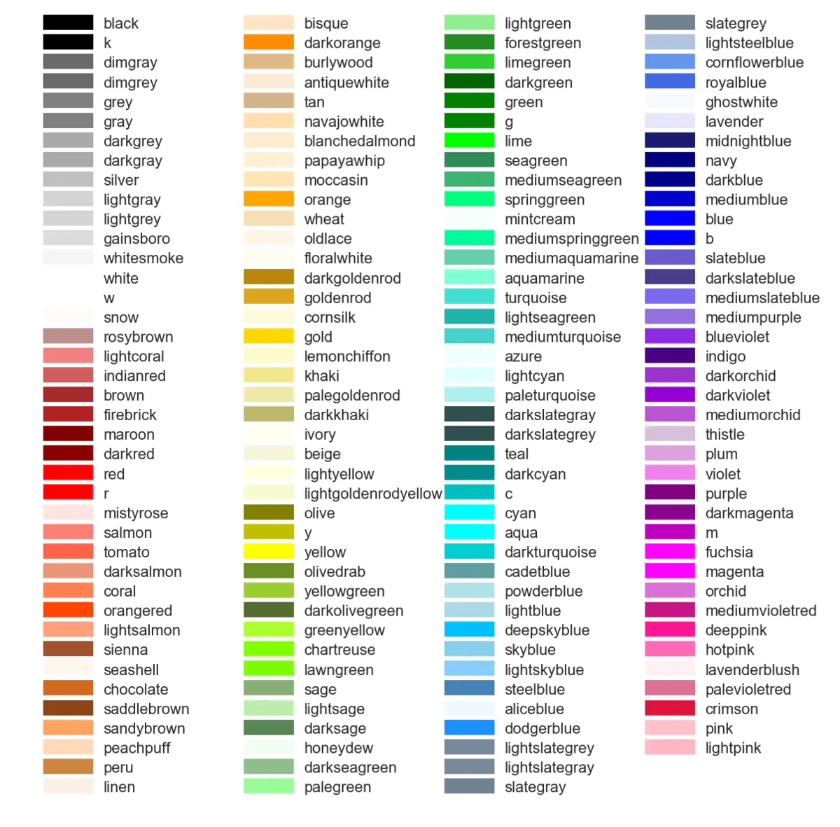
颜色表 def get_cmap (n, name='hsv' ): '''Returns a function that maps each index in 0, 1, ..., n-1 to a distinct RGB color; the keyword argument name must be a standard mpl colormap name.''' return plt.cm.get_cmap(name, n) cmap = get_cmap(20 ) plt.plot(x, row.T, cmap(colorIdex), label='raw data' )
显示文字,标题,坐标说明 坐标轴说明:plt.xlabel()、plt.ylabel()
图例 legend
plt.legend(["dataAppend" ,"measured_data" ]) for it in m_list: pt, = ax2.plot(x, it) pt_list.append(pt) df_m2 = pd.DataFrame(it, columns=['data' ], dtype=float ) m2max = df_m2.max () m2min = df_m2.min () print ("m{}={:10.4f}" .format (idx,m2max[0 ] - m2min[0 ])) nl_list.append("m{}={:10.4f}" .format (idx,m2max[0 ] - m2min[0 ])) idx = idx + 1 ax2.legend(pt_list,nl_list, loc='upper right' ) it['text' ] = self.ax.text(x1 + (x2 - x1) / 2 , y2 - 10 , it['name' ], **style).set_clip_on(True )
注解 it['annotate' ] = plt.annotate(it['name' ], xy=(it['points' ][0 ] + (it['points' ][2 ] - it['points' ][0 ]) / 2 , it['points' ][1 ]+(it['points' ][3 ] - it['points' ][1 ])/2 ), xytext=(+30 , +30 ), textcoords='offset points' , fontsize=16 ,arrowprops=dict (arrowstyle='->' , connectionstyle='arc3,rad=.2' )) self.point_list.remove(it) text_object = plt.annotate(label, xy=(x_values[i], y_values[i]), ha='center' )
2d 3d 切换显示 if self.chk3D.get(): self.ax.clear() self.ax = self.fig.add_subplot(111, projection='3d') // 如果不调用这个 工具栏图标功能会有问题 self.toolbar.update() self.ax.plot_surface(self.draw3dlist[0],self.draw3dlist[1], self.draw3dlist[2], cmap=cm.coolwarm) self.fig.tight_layout() else: self.ax.clear() self.ax = self.fig.add_subplot(111) self.toolbar.update() self.draw_contour() // 调整绘图的左边距 self.fig.subplots_adjust(left=0.05) # plot outside the normal area self.canvas.draw()
plot plt.plot() 传入二维的散点p1,p2(p1和p2的长度要一样)时,横坐标x绘制p1,纵坐标y绘制p2
scatter plt.scatter()用于绘制散点图,传入参数必须是二维的:plt.scatter(p1,p2),
一维数组画图 plt.plot() 可以用于绘制折线图。只传入一维的散点(n个)p1时,横坐标对应散点的次序,从0到n-1,纵坐标对应散点的值。示例:
import matplotlib.pyplot as pltimport numpy as np p1=[0 ,1.1 ,1.8 ,3.1 ,4.0 ] plt.figure('Draw' ) plt.plot(p1) plt.show()
同时显示多张图 def draw_1file1 (): file = "ori_data_20200709105813" data = load_data_standard(file + '.txt' ) count = len (data) - 10 data = data[8 :-8 ] plt.figure() plt.plot(-data['1' ]-data['10' ], label='1+10' ) plt.plot(-data['2' ]-data['9' ], label='2+9' ) plt.plot(-data['3' ]-data['12' ], label='3+12' ) plt.plot(-data['4' ]-data['11' ], label='4+11' ) plt.plot(-data['5' ]-data['14' ], label='5+14' ) plt.plot(-data['6' ] - data['13' ], label='6+13' ) plt.plot(-data['7' ] - data['16' ], label='7+16' ) plt.plot(-data['8' ] - data['15' ], label='8+15' ) plt.legend() plt.grid(linestyle='-.' ) plt.draw() def draw_1file (): file = "ori_data_20200709105813" data = load_data_standard(file + '.txt' ) count = len (data) - 10 data = data[8 :-8 ] plt.figure() plt.plot(data['1' ], label='1' ) plt.plot(data['2' ], label='2' ) plt.plot(data['10' ], label='10' ) plt.plot(data['3' ], label='3' ) plt.plot(data['4' ], label='4' ) plt.plot(data['12' ], label='12' ) plt.plot(data['5' ], label='5' ) plt.plot(data['14' ], label='14' ) plt.plot(data['7' ], label='7' ) plt.plot(data['8' ], label='8' ) plt.plot(data['9' ], label='9' ) plt.plot(data['11' ], label='11' ) plt.plot(data['13' ], label='13' ) plt.plot(data['15' ], label='15' ) plt.plot(data['16' ], label='16' ) plt.legend() plt.grid(linestyle='-.' ) plt.draw() pass if __name__ == "__main__" : draw_1file1() draw_1file() plt.show()
鼠标控制 import matplotlib.pyplot as pltimport numpy as np fig = plt.figure() def call_back (event ): axtemp=event.inaxes x_min, x_max = axtemp.get_xlim() fanwei = (x_max - x_min) / 10 if event.button == 'up' : axtemp.set (xlim=(x_min + fanwei, x_max - fanwei)) print ('up' ) elif event.button == 'down' : axtemp.set (xlim=(x_min - fanwei, x_max + fanwei)) print ('down' ) fig.canvas.draw_idle() fig.canvas.mpl_connect('scroll_event' , call_back) fig.canvas.mpl_connect('button_press_event' , call_back) ax1 = plt.subplot(3 ,1 ,1 ) ax1.xaxis.set_major_formatter(plt.NullFormatter()) x = np.linspace(-5 , 5 , 10 ) y = x ** 2 + 1 plt.ylabel('first' ) plt.plot(x, y) plt.grid() ax2 = plt.subplot(3 ,1 ,2 ) ax2.xaxis.set_major_formatter(plt.NullFormatter()) y1=-x**2 +1 plt.plot(x, y1) ax3 = plt.subplot(3 ,1 ,3 ) y3=-x*2 +1 plt.plot(x, y3) plt.show()
选择数据点事件 fig = plt.figure() ax = fig.add_subplot(111 ) ax.set_title('click on points' ) line, = ax.plot(np.random.rand(100 ), 'o' , picker=5 ) def onpick (event ): thisline = event.artist xdata = thisline.get_xdata() ydata = thisline.get_ydata() ind = event.ind points = tuple (zip (xdata[ind], ydata[ind])) print ('onpick points:' , points) fig.canvas.mpl_connect('pick_event' , onpick) plt.show()